
The entrance to a home is an important moment in an interior. It takes us from the outside world into the private and personal. The foyer condenses interior design in a nutshell: it must function well and convey the feel, tone and style of the owner. We can express “welcome” in any way we choose; artistically, colorfully, simply. The whole design vocabulary is available – and so, consciously or not, we all select elements that describe us at the entryway to our home.
I am often asked about my personal design style ... and my answer is usually a bit vague, “… as I like to work in a variety of styles ...” In this chapter of my design life, I have a more personal, authentic approach. So, it is fitting the first blog post for P.S. Interior Design Studio is about my own home’s un-foyer. We live in a very open plan, mid-century ranch which we love and have gradually re-designed over 11 years. This snapshot of the main entrance says a lot about the primary influences and energy fueling my designs.
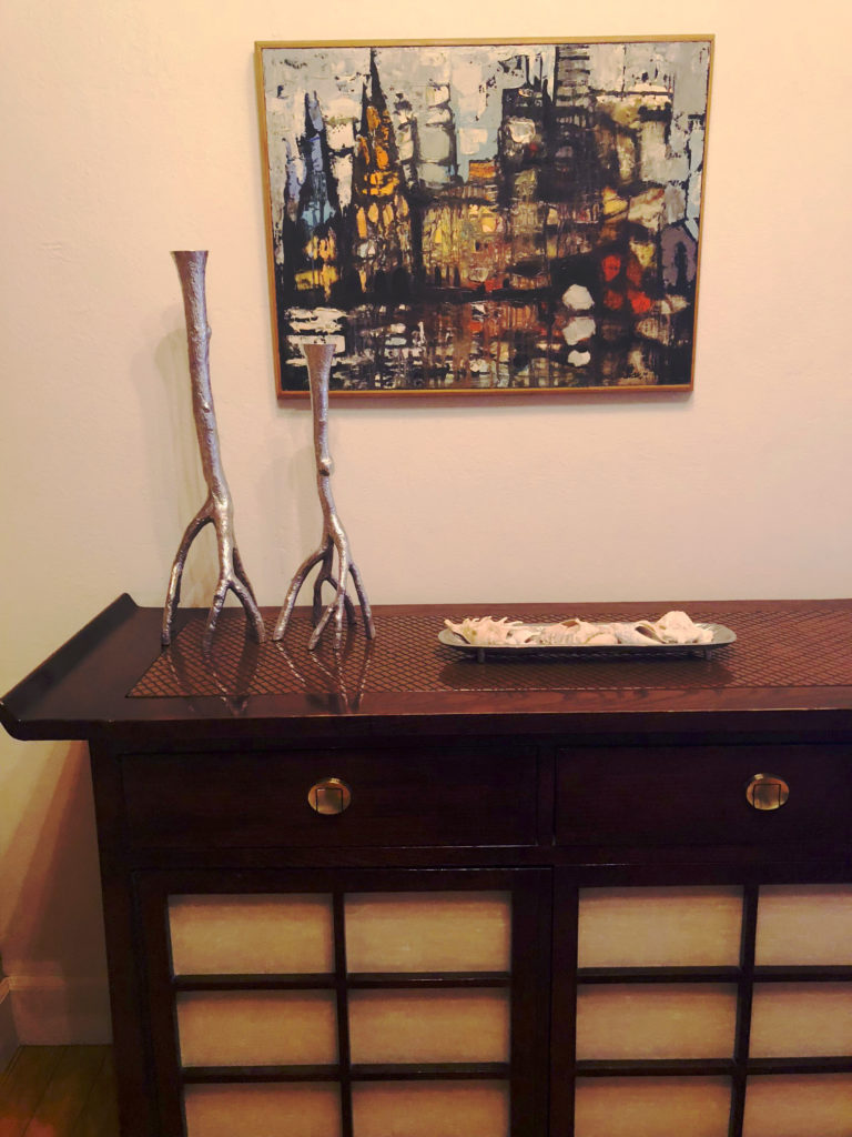
Clean lines. The front door lets in a rectangular sliver of Florida light. Each piece is simple, but a statement on its own. The vintage buffet in mahogany with raw silk insets is a Sarasota resale shop find and serves as a multi-purpose catch-all for my very real-life family. The light fixture, a mod ceiling mounted bit of whimsy, serves as ambient light as well as sculpture, from Light Up Your Life, Sarasota.
Mixed styles. Maybe a hint of Japanese, a lot of Bauhaus, dark woods, slightly worn vintage textures … the art of the mix. Some folks have a knack for it in the kitchen or concocting cocktails. My thing is bringing different influences and materials together in an unexpected but balanced way.
Original art. Makes all the difference in an interior space; feels good and often has special meaning. The oil painting above the buffet was done by a family friend and has moved from home to office to next home, always showing us different textures and depth of color. The print is this little favorite.
Perfect imperfection. The wood floors of our home have a very real patina, to use a designer term for pretty beat up. And we like it that way … it isn’t precious, but still beautiful. We accept and celebrate wood’s idiosyncrasies. When clients are comfortable and it’s practical, using natural materials seems to anchor a space in a timeless way.
Color. The tangerine color of the dropped entry ceiling defines the space, since it’s not a true foyer. It is also the right jolt that connects to the rest of our home, yet doesn’t influence the artwork. Shades of white on the walls and column layer the small entry area, creating more depth to the space. The use of color in interiors, whether boldly or subtly, is powerful and endlessly fascinating to me.
Personal history. The Eames chair in our entry is from my childhood home – my parents, particularly my father, loved modern furniture design. Until I visited MOMA in my teens, I didn’t realize the extent of their passion, as so many pieces I grew up with were in the decorative art exhibit. Creativity and love of all design are part of my family history; for my grandmother and her sisters, it was in fashion – and a family business in Philadelphia carries on today by a third generation. Reminders of these arty characters and their unique eye for design infuse my work – and make my home feel like my home. I encourage clients to do the same; let their history be a part of their home’s design story.

© 2024 PS INTERIOR DESIGN STUDIO. ALL RIGHTS RESERVED. WEBSITE DESIGN AND DEVELOPMENT: BGDWEB